
Appearance
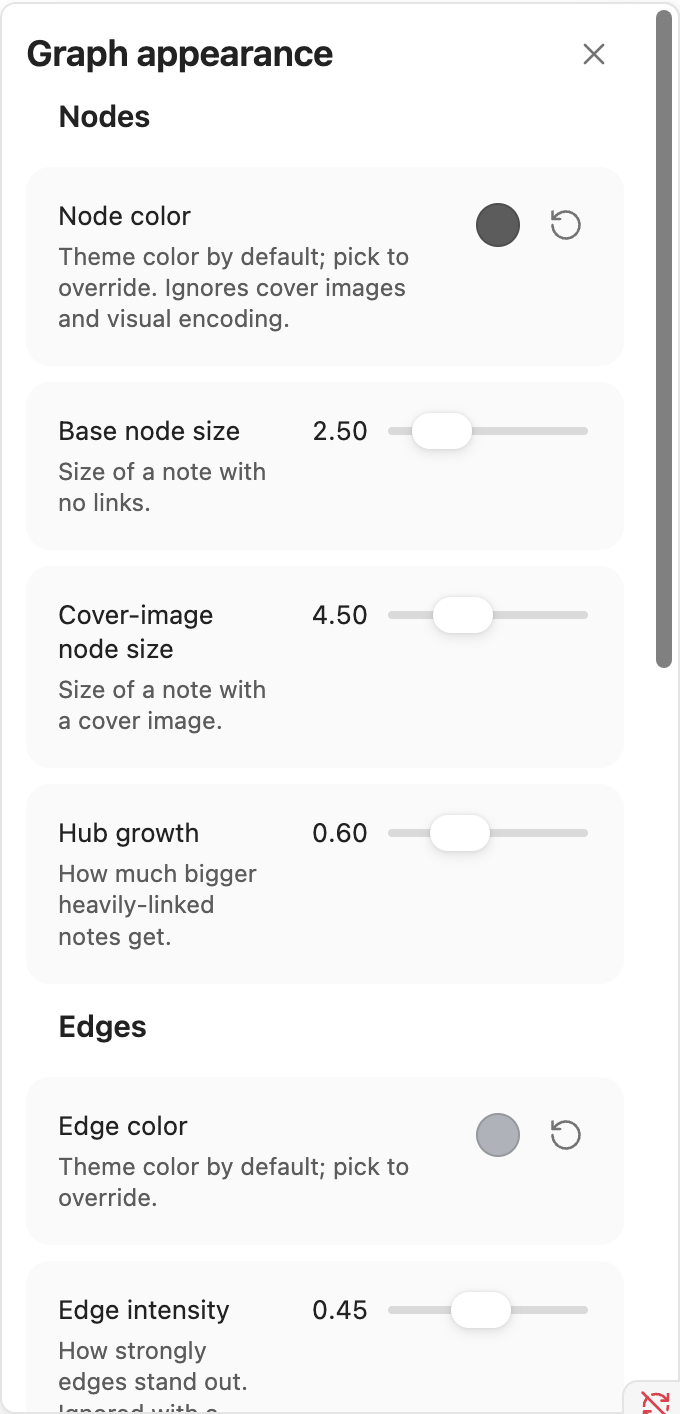
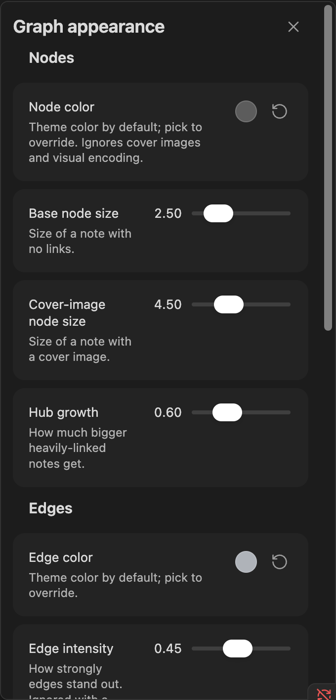
Click the Appearance toolbar icon to tune how the graph looks - every slider applies live, so you can watch the graph react while dragging.
Show as nodes
Three independent toggles, all off by default, each adding real nodes/edges to the graph (a structural change, not just a style tweak):
- Tags - every tag becomes its own node, linked to each note that carries it.
- Attachments - every embedded image/PDF becomes its own leaf node on the note that embeds it.
- Non-existent links - a placeholder node for every link to a note that doesn't exist yet (a "ghost node").
Nodes & edges
- Node color - theme color by default; pick to override. Ignores cover images and Color & size groups.
- Node size - base size, and how much it grows with a note's own link count.
- Edge color/intensity - theme color by default (pick to override), and how strongly edges stand out against the background.
- Show edge direction - draws arrowheads for directional links, with its own size slider once enabled. Edges are always drawn as straight lines.
- Cluster heatmap - the soft glow behind Isolated clusters/Structural deviation's Diagnostics highlight and enabled Community/Semantic clustering Color & size groups. On by default; turn it off if you find it visually busy - the plain recolor/dim highlight and flat group coloring underneath are unaffected either way, only the glow itself.
Physics (Force layout)
Only shown while Force layout is active - Hierarchical/Radial/Circular have their own spacing sliders instead, shown only while that layout is active.
- Gravity - how strongly notes are pulled toward the center.
- Scaling ratio - overall repulsion/attraction strength.
- Dissuade hubs - spreads a heavily-linked note's neighbors out around it instead of clumping them on top of it.
- Tighter clusters - pulls closely-linked notes into denser, more separated clusters.
Labels
- Label size threshold - how zoomed-in you need to be before a note's title appears.
- Label density - how many labels are allowed to show at once before some get hidden to avoid clutter.
Pinned node positions
A count of how many notes you've manually pinned by dragging them (see Interacting with the graph), with a "Clear all" button to un-pin every one of them at once.
Reset to defaults
Puts every slider and toggle above back to its shipped default in one click.